

Stone and Siding Color Combinations for Your Home
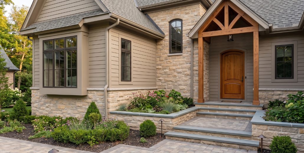
A successful home exterior does not require every material to match.
Stone, siding, roofing, trim, windows, doors, and pavers all have different textures and purposes. When every surface is forced into nearly the same color, the exterior can lose depth. When every material moves in a different direction, the home can feel disconnected.
The goal is coordination.
For homeowners comparing stone and masonry options for West Michigan homes, building a simple exterior material palette before making individual selections can help the finished home feel more intentional.
Key Takeaways / Summary
- Start with permanent materials. Roofing, existing stone, brick, windows, and other elements that will remain should guide new selections.
- Coordinate instead of matching. Stone and siding can be different colors while sharing related undertones.
- Give one material the lead role. Too many strong colors and textures can compete for attention.
- Use contrast intentionally. Trim, windows, doors, and accents can provide definition without overwhelming the home.
- Include the hardscape. Pavers, steps, retaining walls, and concrete are part of the exterior palette too.
- Review physical samples outdoors. Natural light can change how stone, siding, roofing, and pavers appear.
The main idea is simple: the strongest exterior palettes create relationships between materials without requiring every finish to be identical.
Start With the Materials That Are Not Changing
Before choosing a new siding or stone color, identify the exterior elements that are likely to remain.
These may include:
- Roofing
- Existing brick or stone
- Window frames
- Garage doors
- Concrete
- Driveways
- Major landscape stone
Permanent materials are useful starting points because changing them later can be expensive or impractical.
Benjamin Moore's exterior color palette guidance recommends taking color direction from unchanging elements such as roofing, stone, brick, and the surrounding landscape.
Practical tip: Photograph the front, sides, and rear of the home before shopping. Mark every visible material that will remain. Those colors become the foundation of the new palette.
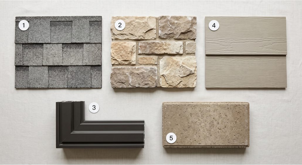
- Roof
- Stone
- Trim and windows
- Siding
- Hardscape
Stone and Siding Do Not Need to Match
Matching and coordinating are different.
If the stone contains beige, cream, taupe, and muted gray, the siding does not need to reproduce the exact same beige. It may work better as a quieter greige, muted green, warm white, or another related color.
James Hardie's stone and siding combination ideas demonstrate how siding and masonry can use either subtle contrast or related colors to create a cohesive exterior.
The important relationship is usually found in the undertones rather than an exact color match.
Identify Whether the Existing Materials Feel Warm or Cool
One practical way to narrow the palette is to identify the undertones already present.
Warm exterior materials may contain:
- Cream
- Tan
- Brown
- Rust
- Gold
- Warm gray
Cool exterior materials may contain:
- Blue-gray
- Charcoal
- Cool white
- Slate
- Gray-green
LP Building Solutions provides additional guidance on coordinating siding colors with stone and emphasizes identifying whether the stone itself reads warm or cool.
Practical tip: Do not evaluate only the largest color in the stone. Look at the smaller secondary tones. A small charcoal accent in the masonry may connect naturally with dark windows or roofing.
Let One Material Lead the Palette
An exterior becomes difficult to coordinate when several materials are competing for attention.
Decide which surface should carry the most visual character.
For example:
- If the stone has strong texture and color variation, keep the siding relatively quiet.
- If the siding uses a distinctive color, consider a more restrained stone blend.
- If the architecture has extensive brick, additional stone may work best as a supporting material rather than another focal point.
This does not mean the supporting materials need to be plain. They simply should not all demand equal attention.
Use a Limited Exterior Color Family
Homeowners often make exterior selections one at a time and unintentionally accumulate too many unrelated colors.
Benjamin Moore notes that homeowners commonly use three to four colors within an exterior color scheme when body color, trim, doors, shutters, and other elements are considered.
Masonry and roofing add additional fixed colors, so restraint becomes even more important.
A useful approach is to establish:
- A dominant exterior color
- A supporting masonry palette
- A trim or window color
- An optional accent at the front door or another small feature
Practical tip: If you cannot explain what role a new color plays in the palette, it may not need to be added.
Use Contrast to Define the Architecture
Contrast helps important features remain visible.
A light home with slightly darker windows may gain clearer definition. Dark siding can feel less heavy when paired with lighter stone. A warm wood entry door can introduce natural contrast without requiring another painted accent color.
Contrast can be created through:
- Light versus dark
- Smooth versus textured
- Warm versus neutral
- Painted versus natural materials
The goal is not maximum contrast. It is enough difference to keep the materials from visually blending into one surface.
Coordinate Texture as Carefully as Color
Color is only one part of an exterior palette.
A house may also include horizontal siding, vertical siding, rugged stone, brick, wood grain, metal roofing, and patterned pavers.
If all of these materials have strong texture, the exterior can become visually crowded even when the colors coordinate.
A deeply textured stone often benefits from a simpler siding profile. A clean, contemporary masonry profile may support more variation elsewhere.
Homeowners can review VanderWall's guide on coordinating stone and brick with the home's style for more detail on masonry texture, scale, and architecture.
Remember That the Roof Is Part of the Palette
Roofing occupies a large visible area on many homes, yet it is easy to overlook when comparing siding samples at eye level.
A brown or weathered roof may support warmer exterior materials. Charcoal or gray roofing may provide a stronger connection to cool stone, muted siding, or dark windows.
The siding does not have to duplicate the roof color.
Instead, look for a relationship between the undertones.
Practical tip: Hold exterior samples where you can see both the material and the roof at the same time. A combination that works on a table may feel different when the roof enters the view.
Treat Windows, Gutters, and Trim as One Supporting System
Smaller exterior elements repeat many times across the home.
Window frames, gutters, downspouts, fascia, soffits, and trim can quietly connect the larger materials.
If the home has black or dark-bronze windows, repeating that color selectively in gutters or small metal details can create continuity.
That does not mean every trim element must become black.
Consider where dark contrast adds definition and where lighter trim helps separate the roof, siding, and stone.
Use the Front Door for Controlled Personality
The front door is one place where an exterior palette can tolerate more personality because it occupies relatively little visual area.
Possible directions include:
- Natural wood
- Deep green
- Muted blue
- Charcoal
- Warm neutral
If the stone and siding already include several strong colors, however, the door may work better as a quieter continuation of the palette.
The front door should finish the composition rather than introduce an unrelated color simply because it is available.
Include Pavers and Hardscapes in the Exterior Palette
The home does not visually stop at the foundation.
Walkways, patios, retaining walls, steps, and driveways sit directly beside the exterior materials and influence how the full property reads.
When selecting pavers and hardscape materials, look for subtle connections to the house.
A paver blend might repeat:
- A warm gray from the stone
- A tan from the masonry
- A charcoal accent from the windows
- A muted neutral from the siding
The paver does not need to match the stone. One or two shared tones may be enough to create continuity.
Repeat Materials With Restraint Across the Property
Repetition can help separate areas feel connected.
Exterior stone might reappear on:
- Entry columns
- A fireplace
- An outdoor kitchen
- A landscape wall
The same principle can apply to paver colors, wood finishes, or metal accents.
The repetition does not need to be exact. Related tones or textures can create enough connection.
Too much repetition can make the property feel overly coordinated, while too many unrelated materials can make each project look separate.
Consider How Much of Each Material Will Be Visible
Scale changes how strong a material feels.
A dark stone used on two entry columns may function as an accent. The same product covering the entire lower level of the home can become one of the dominant colors.
Before finalizing the palette, estimate how much visual area each material will occupy.
Ask:
- Is the stone an accent or a major facade material?
- Does siding cover most of the home?
- How visible is the roof from the street?
- How much paver surface appears near the entrance?
- Do dark windows repeat across the entire elevation?
The larger the material coverage, the more influence it has on the complete palette.
Review Stone Color and Variation Separately
Stone adds another level of complexity because one product may contain several colors.
VanderWall's guide to choosing stone veneer colors explains how texture, lighting, mortar, and surrounding materials affect the way stone appears.
When using that stone as part of a larger exterior palette, identify:
- The dominant stone color
- The secondary colors
- The darkest accent
- The mortar color
- Whether the complete blend reads warm or cool from a distance
Those secondary colors often provide useful clues for siding and trim selection.
Review the Complete Palette Outdoors
Exterior materials should be evaluated under exterior light.
Colors can change noticeably between a showroom, phone screen, shaded porch, direct sun, and overcast conditions.
Create a temporary sample grouping that includes as many real materials as possible:
- Roofing sample or clear photo
- Stone sample
- Siding sample
- Trim or window finish
- Paver sample
Look at the combination from several feet away and at different times of day.
Practical tip: Do not make the final choice while holding one sample directly in front of your face. Exterior materials are usually viewed from much farther away.
Build a Portable Material Board
A simple physical palette board can prevent decisions from becoming fragmented.
Collect small samples or accurate references for every confirmed finish and keep them together during the selection process.
Your board may include:
- Roof shingle
- Stone or brick
- Siding
- Trim
- Window finish
- Door finish
- Paver
- Mortar sample
When considering another product, place it beside the entire palette instead of comparing it only with the material immediately next to it.
Watch for These Common Exterior Palette Problems
Too Many Undertones
A cool gray roof, orange-brown stone, blue siding, and cream trim may each look attractive separately but can pull the home in several directions.
Everything Is the Same Tone
When siding, stone, pavers, and trim all sit within nearly the same value and color, architectural features may disappear.
Too Many Focal Materials
Strong stone, bold siding, contrasting brick, dramatic trim, and highly patterned pavers can compete instead of supporting one another.
Choosing From Screens Only
Digital tools are useful for narrowing choices but cannot reliably reproduce every material's exact texture, depth, or color.
Ignoring Future Projects
If a patio, outdoor kitchen, fireplace, or additional masonry is planned later, consider how today's palette can support those future phases.
VanderWall's phased home improvement planning guide provides additional guidance on connecting work completed at different times.
A Practical Exterior Material Selection Guide
1. Photograph the Existing Home
Capture each elevation, roof, landscaping, and permanent material.
2. Identify Fixed Elements
List everything that will remain and determine whether those materials lean warm, cool, or neutral.
3. Choose the Dominant Material
Decide whether siding, stone, brick, or another surface should carry the most visual character.
4. Add One Supporting Material at a Time
Compare each new selection with the full palette before approving it.
5. Check Texture and Scale
Make sure multiple materials are not competing through strong patterns or overly similar scale.
6. Add Hardscape Materials
Include pavers, steps, walls, and other surfaces that will be visible near the home.
7. Review Everything Outdoors
Look at physical samples in sun and shade from a realistic viewing distance.
8. Photograph the Approved Palette
Keep product names, colors, manufacturers, and photos together for future phases or replacement needs.
Compare Exterior Materials in Person
Photographs and visualizers are useful for gathering ideas, but exterior materials gain much of their character from physical texture, depth, scale, and variation.
Homeowners can compare exterior materials in person at VanderWall's Spring Lake and Grand Rapids showrooms.
VanderWall's current displays include natural and manufactured stone, brick, fireplaces, pavers, steps, and retaining-wall materials.
Practical tip: Bring photos of the home and samples of roofing, siding, paint, or other materials already selected. Comparing them beside real masonry can be more useful than trying to remember the color.
How VanderWall Supports Material Planning
VanderWall Brothers works with homeowners, builders, and contractors across stone, brick, fireplaces, patios, pavers, outdoor kitchens, and related masonry and outdoor living products.
Through project support throughout West Michigan, clients can compare materials while considering how each selection relates to the complete property.
The goal is not to make every material match.
It is to create enough connection between colors, textures, and scale that separate parts of the home feel like they belong together.
A Coordinated Exterior Should Have Relationships, Not Copies
Stone and siding color combinations work best when they are considered as part of a larger exterior palette.
The roof influences the color direction. Stone introduces texture and variation. Siding creates the largest field of color on many homes. Trim and windows provide definition. Pavers and landscaping extend the palette beyond the walls.
Those materials do not need to be identical.
They need a reason to belong together.
By starting with permanent materials, identifying undertones, limiting competing textures, using contrast deliberately, and reviewing physical samples in real light, homeowners can create an exterior that feels coordinated without looking overly matched.
If you are comparing stone, masonry, pavers, fireplaces, or outdoor living materials for an upcoming project, talk with the VanderWall team. Call (616) 842-4500 or visit www.vanderwallbros.com.
What we do
This is work we take on
Reading up is the first step. When you want it built, priced or supplied, these are the pages that cover it.
Keep reading
Fireplace Inserts Everything You Need to Know
Michigan is known for its harsh weather, and it is not uncommon for temperatures to drop well below freezing during the…
Patio Pavers: Which type is right for my home?
Patio pavers add a beautiful element to any garden, walkway, or patio. Today, there are endless possibilities when it…
Gas Fireplace Inserts: Everything You Need To Know
Michigan is known for its harsh weather, and it is not uncommon for temperatures to drop well below freezing during the…
Thinking about a project like this?
Reading about it only gets you so far. Tell us the room and we will tell you what is possible in it.
Rather just ask someone?
Call the showroom. If it takes two minutes on the phone we would rather tell you than have you read around it.